 For many SaaS and Cloud providers, email will be the main fuel for your Engagement Engine that you use to drive potential customers through your Free Trial to conversion or to drive new customers to become deeply invested in your service.
SaaS customer onboarding starts with the welcome email, so when I saw this great post over on the Vero blog called 5 Conversion Optimization Experts Weigh In On An Email Remarketing Campaign I was excited to see people talking about this important – and often overlooked – element.
In the post, 5 copywriters – arguably the best in the business – analyze and offer suggestions to the welcome email of HipChat.
I agree with just about everything the panel of experts said, but I think they missed a couple of points.
While Sasha Gilberg from 2xconversion.com touched on a couple of these, I think the panel missed these points not because they don’t understand email marketing and copywriting, but because these points are fairly specific to SaaS and Cloud providers – like HipChat.
If you don’t think the way I do – or the way those companies I’ve worked with do – you might overlook these things, too.
Since I don’t want that to happen, I decided to outline how to create an effective welcome email to kickoff the SaaS customer onboarding process.
Email Marketing Best Practices
First and foremost, the welcome email must be built off of best practices and should be expected by the prospect or new customer.
Be sure to tell ’em after they sign-up that they’ll get an email, what the subject is and who it’s from so they’ll be sure to look for it and open it.
From there, the welcome message should speak to the reader (direct marketing), be personalized, have a compelling subject (headline) & copy, from a real person (as opposed to “noreply@” – I like what Peep Laja from ConversionXL said… “PleaseReply@” might be better), etc. For more on these best practices absolutely read the post on the Vero blog and checkout my 5 Tips for SaaS Providers to Successfully Use Email post.
SaaS Customer Onboarding: Create a Successful Welcome Email
Now, once you have a clear understanding of the core requirements for any SaaS marketing or transactional email message, you can apply these ideas specifically to your welcome email.
1. The Email Must Be Part of a Well-Defined Process
Remember… while engagement includes onboarding (the welcome message would be the first step in the SaaS customer onboarding process)… onboarding doesn’t necessarily require engagement.
But when you’re bringing a new customer or prospect into the fold, you’re shooting for deep engagement here… not just functional onboarding.
Why? Because Engagement leads to Investment (time, resources, energy, data, etc.) and Investment leads to Conversion and long-term Retention.
I developed the Common Conversion Activities (CCA) set of metrics as a way of developing a path to drive conversions through Free Trials that allows you to accurately measure engagement in a meaningful way.
Whether you use CCAs or not, just ensure you have a specific goal (conversion, perhaps) and a map for your customer to get there.
The welcome email should get them to do the first thing on the map… get them to take the first step in your CCAs. And that’s all!
If you adhere to this approach you keep your message clear and eliminate confusion for your prospective or new customer (because confused minds don’t buy… they bounce!)
Applying this approach means you will not have a “create a project” link and also a “download our iPhone app” and “Upload your logo” CTAs, too.
Those things might also need to happen, but at the right time and in the right sequence.
Also, I would caution that “add coworker” (and other “viral expansion”) steps are likely best moved to at least a little later in the process (create a hypothesis around this and test, of course) because at first you have a fragile relationship that your prospect or customer might not be willing to bet their social capital on.
If you have a product – like HipChat – that is social in nature and really doesn’t allow someone to recognize value from it until they bring in coworkers, figure out steps they can do to become engaged, invested, and comfortable with the service before they invite others. Maybe even suggest they bring in just a couple of other folks to help setup the network.
You might need to put on your creative thinking cap to come up with what they need to do, but it could be a very worthwhile thought experiment.
Also, as Sasha says, the follow-up to the welcome message ideally is a triggered message based on the action the customer or prospect took.
2. There Should Be a Single, Clear CTA
Your welcome email (often sent separately from an email containing login credentials, but not always) should have one Call to Action (CTA)… one singular goal to get the prospective or new customer back into the app to do the first thing they need to do.
Multiple links are okay (though as Paras Chopra from Visual Website Optimizer says, there is such as thing as too many links), but the links should all go to the same place.
And while these can be both links and a “Big Orange Button” as Sasha called it in the Vero post, the design doesn’t matter if everything else is wrong… once you get the structure right you can enhance it with a compelling design.
I’ve seen a lot of very pretty – but very ineffective – designs used by overly clever SaaS providers.
Tear it down to the basics, get that right, then start designing around that.
Now, just to be clear, you can include other links – perhaps to support and of course to unsubscribe (which should lead to a page that warns them about doing so, perhaps provides options to throttle messages, but ultimately allows them opt out) – but I suggest you keep those below the closing and keep the body (and PS:) for the main CTA.
3. Link Directly Into Your App
The single CTA should lead them directly to the thing they need to do inside the app.
If you have a Getting Started PDF they should read… well, you shouldn’t. Your App should walk them through the process of getting started. No excuses there. Though if you still have that pesky PDF, don’t link directly to it.. link back to the app and let them download and read it from there… but you need to get away from that if you want your app to sell itself.
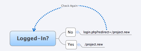
You should build your URL & redirect structure in a way that allows you to link directly into your app from both marketing & transactional messages and, this is key, if they are logged-out, allow them to login and redirect them to the original destination.
So let’s say I have a CCA – Create a Project – that I want to get my prospective customer to do.
I’ll craft a compelling email and the CTA will be to Create a Project. That CTA will link to this:
http://myapp.com/project.new
So when they click on that link it takes them into the app to the Project Creation area (which is hopefully super-intuitive, easy to use, and walks them through the process).
But what if they aren’t logged-in?
Well, the app should redirect them to a login screen that, once they log-in, should redirect them to their original destination. Password recovery/reset should do the same thing upon successful completion and login.

This is so much better than explaining in an email “Go to this site, login, click on ‘Dashboard’ and then click on ‘New Project’.”
You need to make it AS EASY AS POSSIBLE for your potential and new customers to get moving in the right direction as possible.
And since email will likely be a large part of your Engagement Engine, allowing deep linking directly into the app so your customer can take action is required.
Of course,… if your app isn’t built to handle this, then do the “login, select ‘New Project’” stuff because that is all you can do right now… but work on fixing the problem ASAP!

